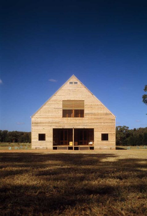
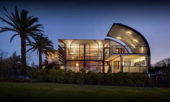
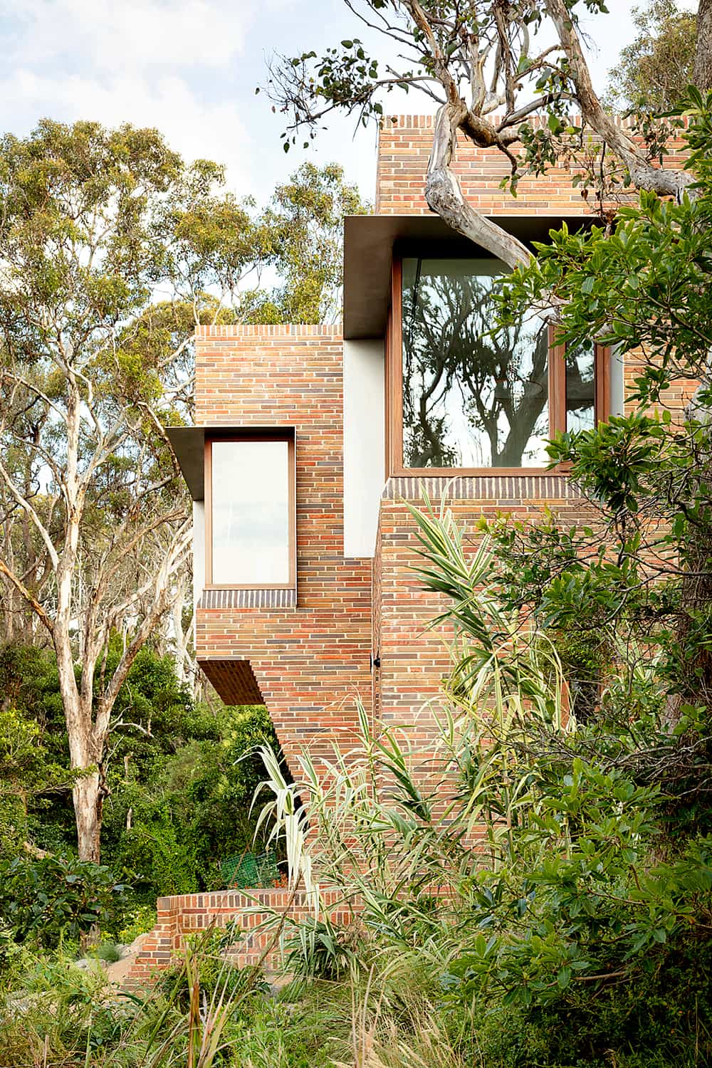
This site has a fascinating history. A hundred and fifty years ago, it housed the Surry Hills timber yard. In the late 1990s, the most recent incarnation before our current rebuild, the house won a Robin Boyd Award. Nevertheless, we felt it was time for a refresh so we asked Virginia Kerridge for a complete redesign and stipulated “As long as you can get Bellevarde”.
Having lived in the place for so long, we knew what we wanted and needed in this new iteration. We knew the angles of the sun and the directions of the cooling breezes. As a result, we’ve managed to create a sustainable and, we think, beautiful home with a small footprint.
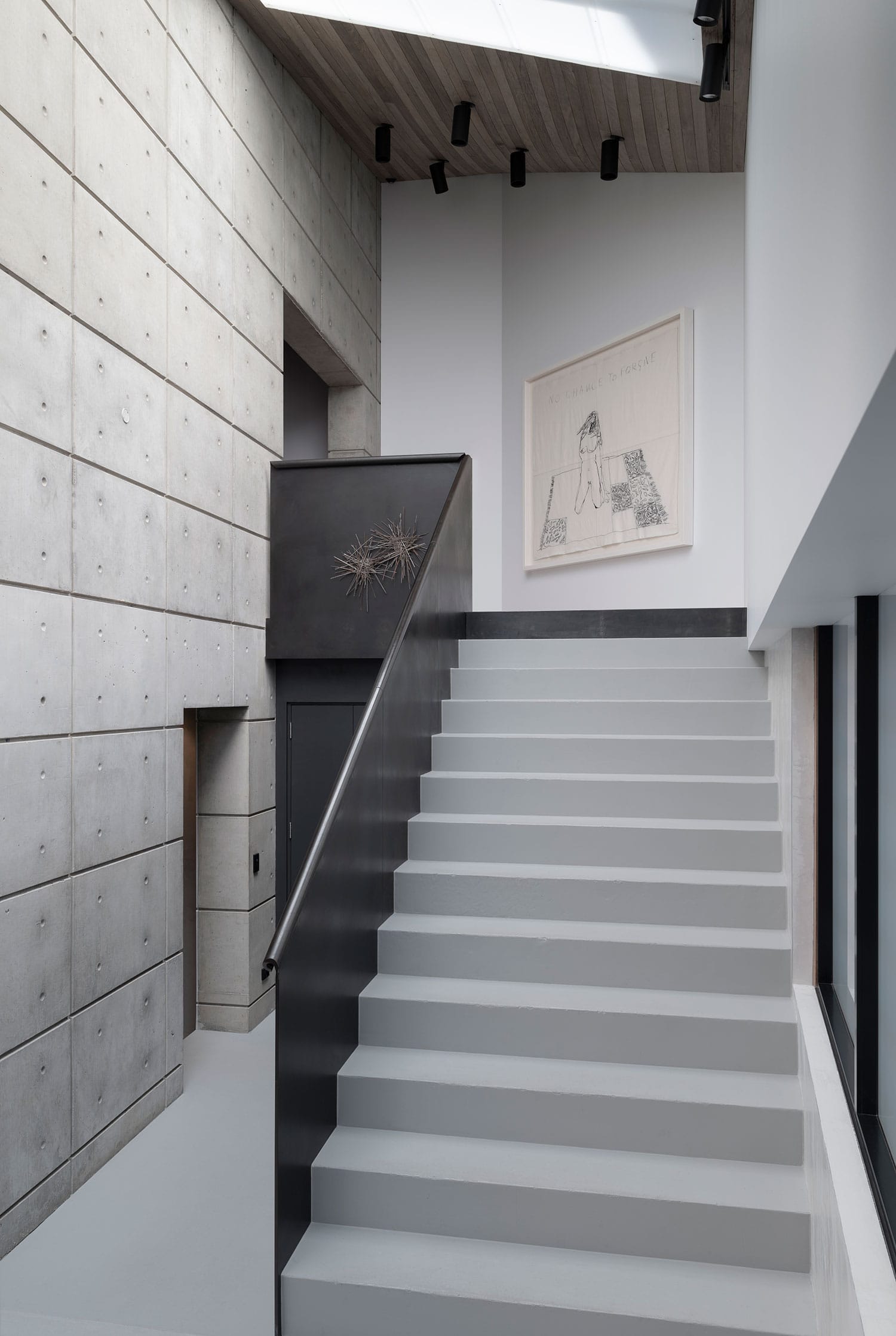
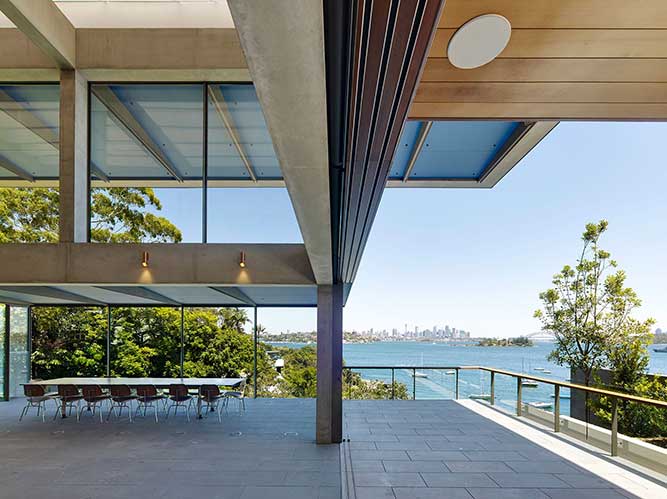
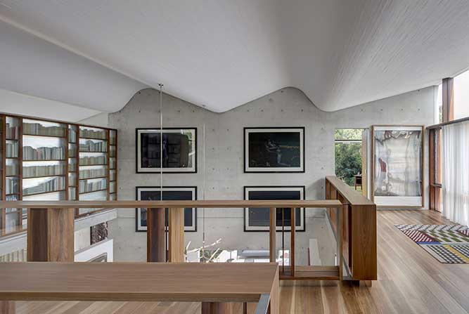
Virginia has a superb eye for detail and Bellevarde’s ability to translate this into something functional make the place feel special. We love the various finishes, steel, wood, concrete, coloured tiles, and the lack of plasterboard. The design seamlessly incorporates some superb level of craft and clever engineering.
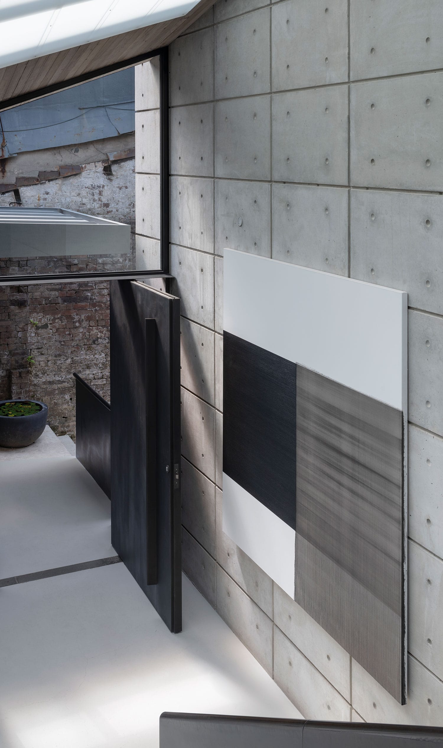
Although the main bedroom contains the one and only air conditioner in the house, it’s often not needed. The passive cooling built into the design allows airflow through via a huge, retractable skylight above the shower in the en-suite. This helps keeps the whole upper floor cool and makes showering on sunny days feel like you’re outdoors.
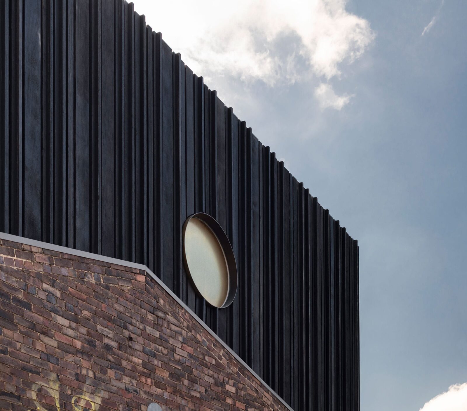
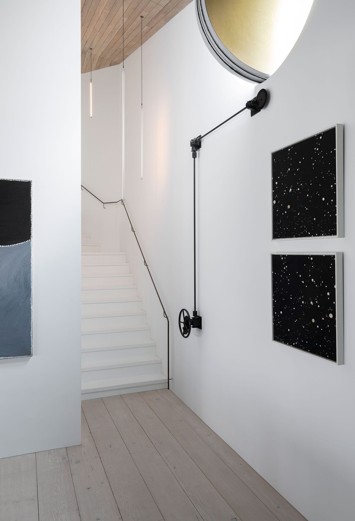
This house has always caught the north-easterly breeze in summer but, when it really heats up and the southerly breeze gets going, there was no cross ventilation. To catch the southerly cross breeze and keep the middle level cool, we installed a circular cutout wall panel that twists open with a clever manual mechanism built by Vincenzo, who became known as “The Steel Guy”. It’s a very neat piece of engineering.
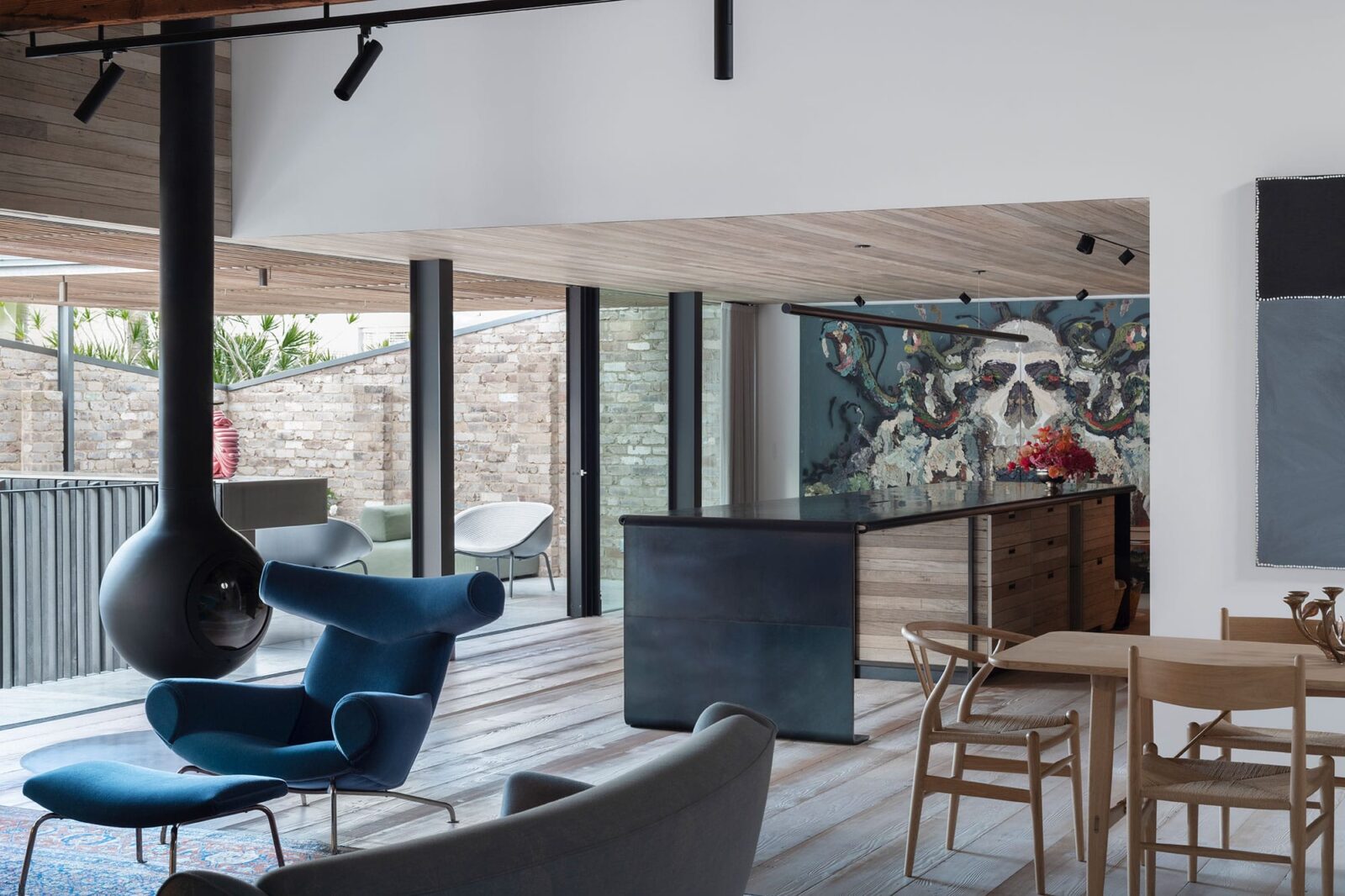
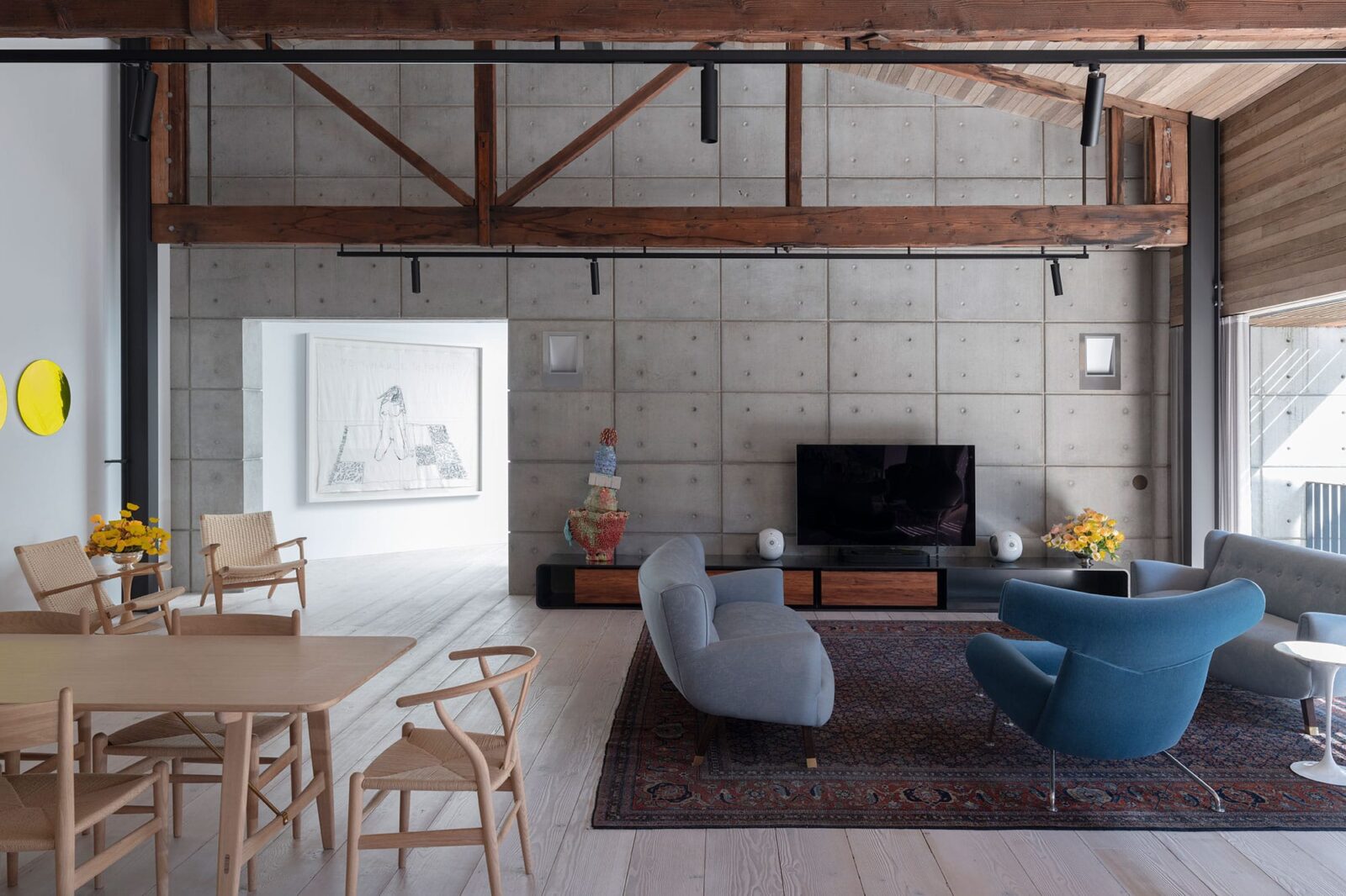
The recycled Australian timber ceiling in the main living area might be our favourite feature. Previously, the room was all plasterboard with three skylights and it was very hot, almost unusable. There’s a lot to love about the timber—the texture, the colour, the softness, the acoustics. The level of craft is extraordinary. Watching Bellevarde build it was glorious. The guys obviously really enjoyed doing it and took such pride in their work. This building isn’t square. To make it look as straight as it does—they were shaving off fractions of a millimetre here and there. It’s that commitment to detail that we appreciated and it was clear they really get a kick out of doing it perfectly.
In the old house, the kitchen was tiny and hidden away. We’re keen entertainers so Virginia suggested we bring it out into the living area and it works wonderfully. The kitchen table is one huge piece of steel that had to be craned into position. The wood from the ceiling is picked up again in the kitchen cabinets. To get the colour we wanted, the lumber had been left sitting in a paddock to fade. Bellevarde would send us pictures and, when it got to just the right shade, we had it shipped down and installed. Virginia is very clever with kitchen spaces and the Bellevarde team realised her plans with care and style.

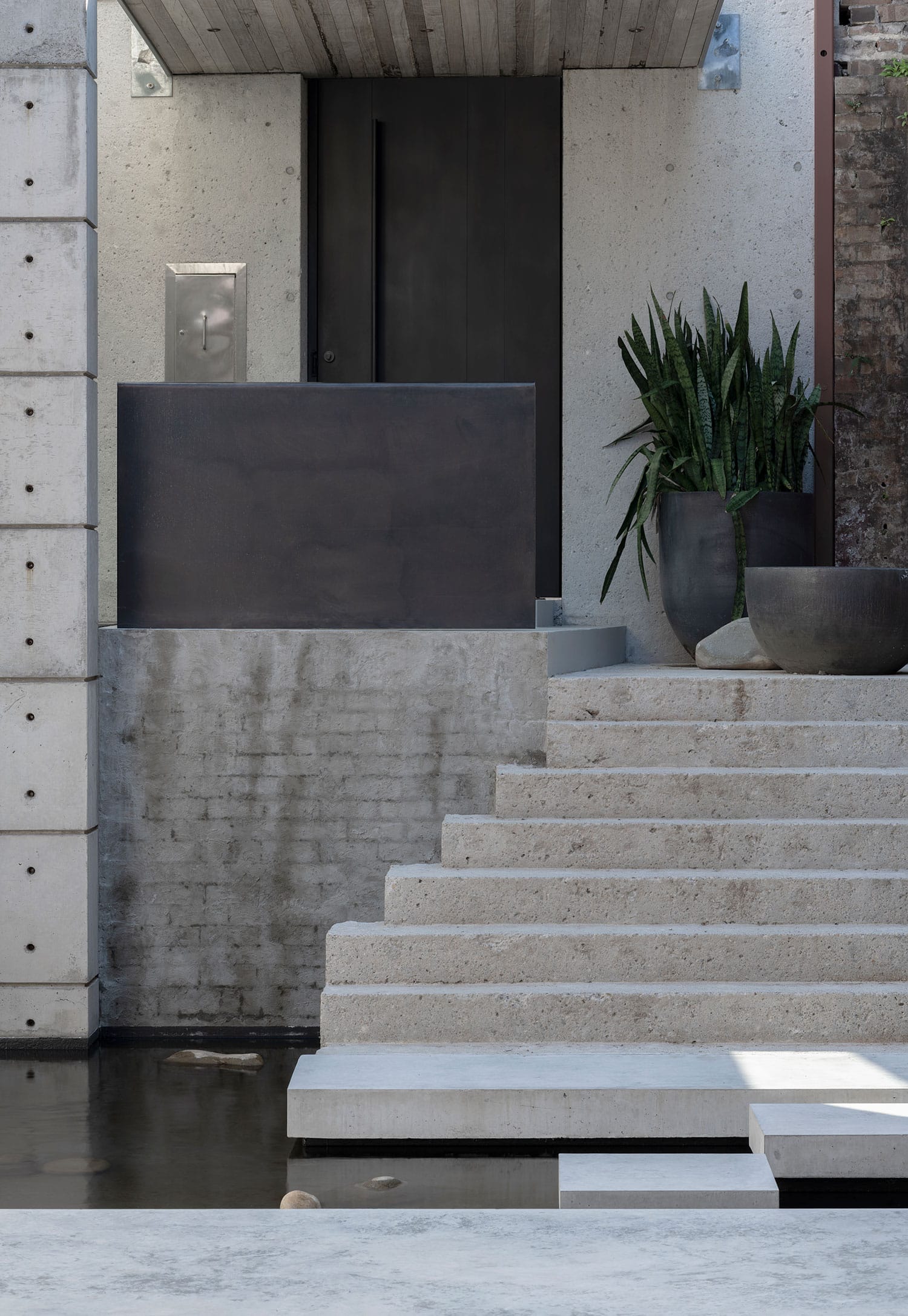
Bellevarde are highly skilled with concrete. They showed me a commercially available concrete tile and then showed me one of their hand-made concrete tiles. Of course, there was no comparison. All of the concrete tiles for the deck area were constructed on-site and we’re thrilled with how they look.
We suspected this would be a build that called for a lot of problem solving and, having worked with them on our gallery in 2001, we knew Bellevarde were more than up to the task. They had to work with what was here, with what had been done previously, and then with a complex new design that has a lot of detail. I was very determined to build with somebody who I knew could deliver and we couldn’t be happier with the result. There are no shortcuts. You get the finish you want.
Photography: Nicholas Watt

